Meta Business Suite (MBS) gives small and medium businesses and creators the ability to manage all of their connected accounts across Facebook and Instagram in one place. With a variety of tools to manage their online presence for free, MBS helps businesses and creators reach more people and stay up-to-date by managing their online presence from one central place.
This project involved working cross-functionally on a complete UX overhaul of the ads creation process and budgeting flow, along with the creation of a strategy that would position Meta Business Suite as the go-to ads platform.
My Roles
· Product design
· Content design
· Product strategy
· Cross-functional collaboration
Team
- · UX Content Designer
- · Product Designers
- · UX Researcher
- · Localization Manager
- · Product Manager
- · Engineering
Years
- 2022-2023
Contact
email@domain.com
000-000-000
Issue
Meta Business Suite, for all its usefulness, was extremely clunky and required users to wade through a lot of content to complete each part of the advertising process. Our users were not professional advertisers, did not have staff to dedicate to their online advertising, and had to manage their own advertising and online presences.
This was in addition to everything else they needed to do to keep their businesses running. In essence, instead of spending time on their business, or on themselves, they had to jump through hoops to accomplish their ad goals.
Solution
A complete UX redo – simplify ruthlessly; trim to the essence of what’s required. Get rid of as much jargon as possible. Make the user experience as easy as checking one’s email – basically, make it intuitive and easy to use.
Steps to a better ad experience
Identify key areas
The first step was to identify the most used areas and features. The idea behind this was to rework them to ensure that MBS’ experience would improve quickly. Once those key areas were improved, other areas could be improved.
Collaborating with a data scientist, 2 key areas were identified based on usage:
- Ad creation
- Budgeting & audience reach
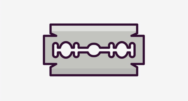
Analyze with a razor
Once the areas had been identified, I analyzed each area’s flow with a view to cutting down extraneous steps to goal completion. While complexity may have a place in the world, it would not be within Meta Business Suite’s user experience.
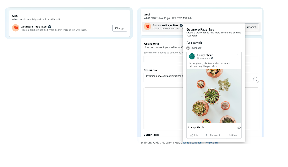
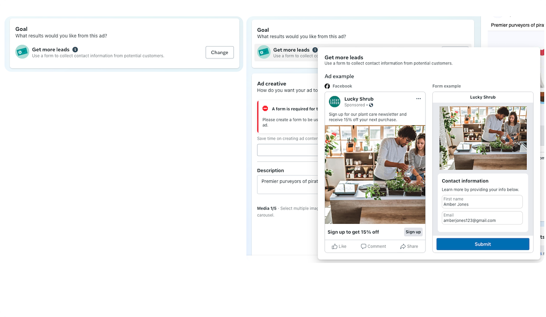
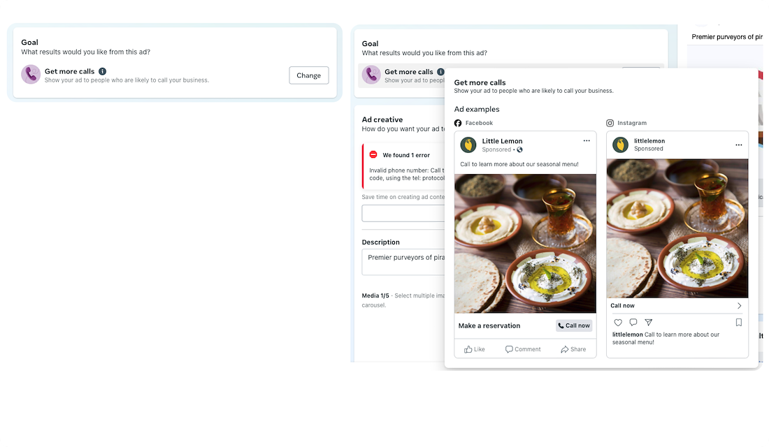
Begone complexity, hello useful ad creation information
Since our users were not ad professionals, they required a certain level of hand-holding to get up and running.
In order to streamline the ad creation process, explanations of terms and goals were added to help them decide what’s best for their business.
Along with this, examples of how the ads would look were also added for a more helpful experience.
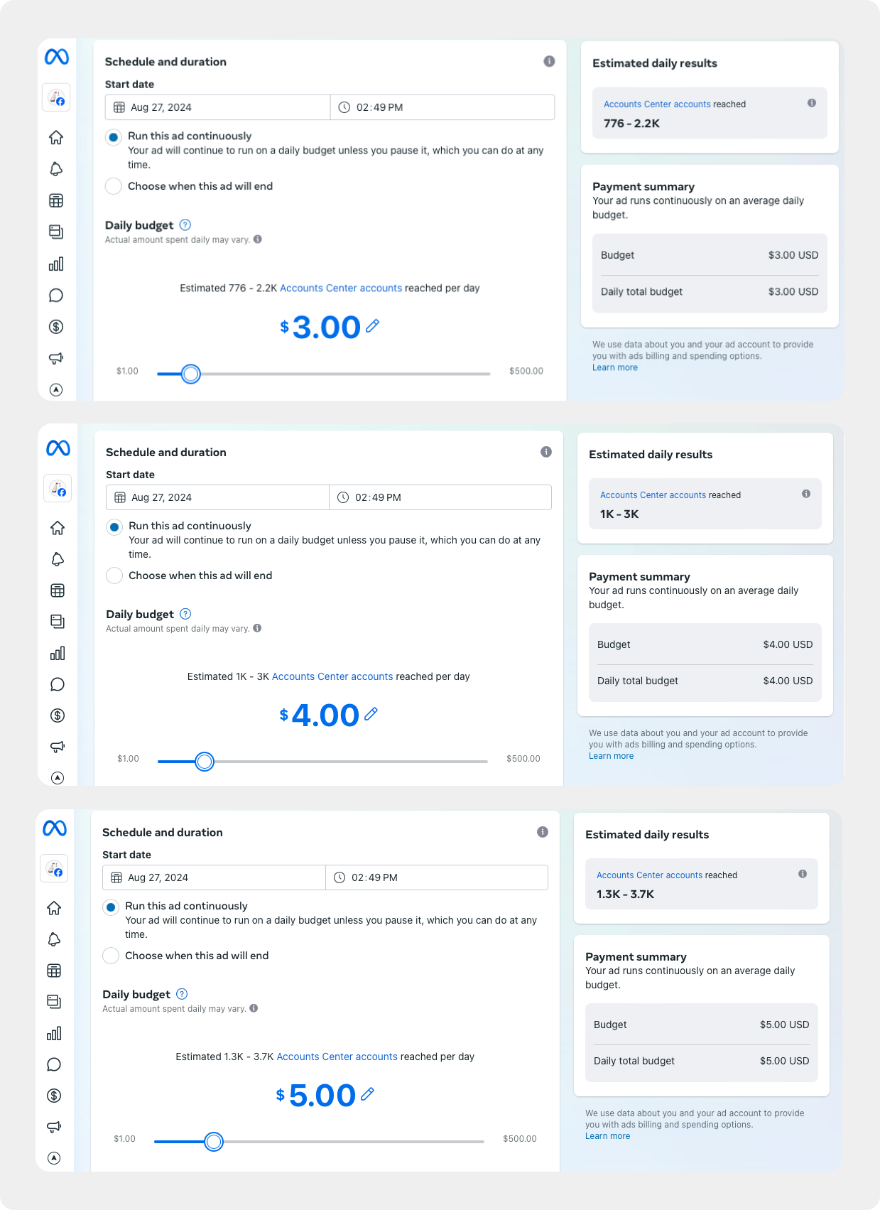
Stretch that %currency_type% !
a.k.a. designing for budgets and audience reach
Our users needed to see for themselves how a little could go a long way in their ad spend. The ad creation page with the budget section in it was already text-heavy, so forcing users to plug in different amounts to see how many people they could reach would be a poor experience.
Generally, showing instead of telling is always a better way to educate people, and play is a great way to teach.
After some interesting design discussions, I landed on a solution that was interactive, as well as illustrative of how a tiny amount could drastically change the potential number of people reached.
There’s a great ending for this project that I’ll tell you about when we chat.
Results
These features, among others that I worked on, are still within Meta Business Suite and are pulling their weight on a daily basis. They’ve made it easier for small business owners to spend less time on creating and managing ads, and spend more time on what really matters – their families, their lives, and their goals.